메인페이지를 만들어야하는데,
나는 프론트를 배운 적이 없다.
일일이 홈페이지 코드 뜯어서 해본 게 끝이다보니
여러 기능이 집합되어있는 메인페이지를 만드는 게 막막했다.
참조 홈페이지 코드를 뜯어보다가
부트스트랩을 이용해보기로 했다.
사실 사용법은 잘 모르는데, 그냥 유튜브 뒤져서 했다.
https://getbootstrap.com/docs/5.3/getting-started/introduction/
Get started with Bootstrap
Bootstrap is a powerful, feature-packed frontend toolkit. Build anything—from prototype to production—in minutes.
getbootstrap.com

Docs에서 원하는 기능을 찾으면 되는데, 나는 Navbar를 사용했다.
근데 문제는 내가 원하는 형태가 아니라서,
그냥 GPT한테 물어보면서 내가 직접 코드 뜯어서 만들었다.
<%@ page language="java" contentType="text/html; charset=UTF-8"
pageEncoding="UTF-8"%>
<!DOCTYPE html>
<html lang="en">
<head>
<meta charset="UTF-8">
<meta name="viewport" content="width=device-width, initial-scale=1.0">
<title>Main Page Header</title>
<style>
body {
margin: 0;
font-family: Arial, sans-serif;
}
/* Header */
.header {
background-color: #ffffff;
box-shadow: 0 2px 4px rgba(0, 0, 0, 0.1);
padding: 10px 0;
position: fixed;
width: 100%;
z-index: 1000;
}
.header-inner {
display: flex;
flex-direction: column;
max-width: 1200px;
margin: 0 auto;
padding: 0 20px;
}
.top-row {
display: flex;
justify-content: space-between;
align-items: center;
}
.bottom-row {
display: flex;
justify-content: space-between;
align-items: center;
margin-top: 10px;
}
.nav-links {
list-style: none;
margin: 0;
padding: 0;
display: flex;
margin-right: 15px;
}
.nav-links li {
margin-left: 20px;
}
.nav-links a {
text-decoration: none;
color: #555555;
}
/* Search Bar */
.search-bar {
background-color: #f1f1f1;
border-radius: 20px;
display: flex;
align-items: center;
padding: 6px 10px;
width: 300px;
}
.search-bar input {
border: none;
background-color: #f1f1f1;
padding: 6px 10px;
width: 100%;
}
.search-icon {
margin-right: 8px;
}
/* Menu Bar */
.menu-bar {
list-style: none;
margin: 0;
padding: 0;
display: flex;
}
.margin1 {
margin-left: 10px;
}
.marginleft {
margin-left: 50px;
}
.menu-bar a {
text-decoration: none;
color: #555555;
}
</style>
</head>
<body>
<header class="header">
<div class="header-inner">
<div class="top-row">
<div class="logo">
<img src="resources/img/logo_white.jpg" width="80" height="70">
</div>
<nav>
<ul class="nav-links">
<li><a href="#">Login</a></li>
<li><a href="#">Sign Up</a></li>
</ul>
</nav>
</div>
<div class="bottom-row">
<ul class="menu-bar">
<li class="margin1"><a href="#">축제</a></li>
<li class="marginleft"><a href="#">공연</a></li>
<li class="marginleft"><a href="#">Instagram</a></li>
<li class="marginleft"><a href="#">MD's Pick</a></li>
<li class="marginleft"><a href="#">고객센터</a></li>
<li class="marginleft"><a href="#">내게 맞는 행사</a></li>
</ul>
<div class="search-bar">
<div class="search-icon">🔍</div>
<input type="text" placeholder="Search...">
</div>
</div>
</div>
</header>
<div style="height: 1000px; background-color: #f7f7f7;"></div>
</body>
</html>
GPT가 답변을 아주 이상하게 해서 애 먹었지만
결과는 만족스럽게 나왔다.
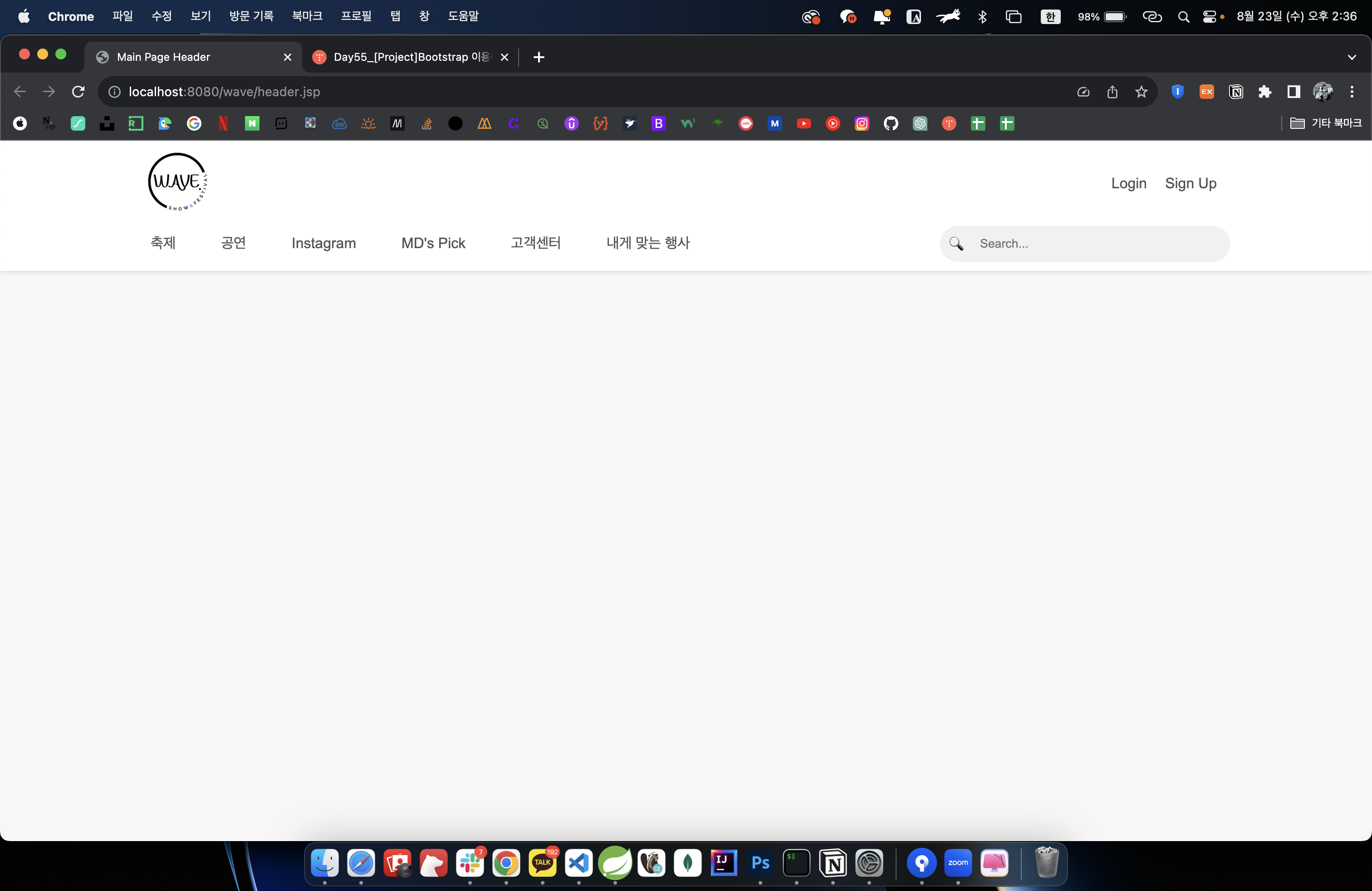
다음은 메인페이지를 완성해야겠다.
'Log > Project' 카테고리의 다른 글
| Day61_Eclipse STS로 MVC RU(One, Update) 만들기 (0) | 2023.08.25 |
|---|---|
| Day61_Eclipse STS로 MVC C(Insert) 프로젝트 만들기 (0) | 2023.08.25 |
| Day59_슬라이드 배너 만들기 (0) | 2023.08.24 |
| Day56_코드 파일 불러오기 (0) | 2023.08.23 |
| Day35_차량정보 페이지 DB 연결_Create, Read, Update, Delete with ORM_DAO&VO(DTO) (0) | 2023.06.25 |


